Reading time: 12 minutes.
Getting the Hang of User Interface Design
User Interface (UI) design is all about making digital stuff look good and easy to use. It’s like the face of your app or website, making sure everything is not just pretty but also works smoothly.
UI vs. UX: What’s the Difference?
Alright, let’s clear this up. UI and User Experience (UX) design are like peanut butter and jelly—they go together but aren’t the same. UX is the whole shebang, focusing on how a user feels when they interact with your product. UI, on the other hand, is the eye candy and the buttons they click. Think of UX as the journey and UI as the car’s dashboard.
So, UI is all about the visuals and how you interact with them. It’s about making sure the buttons are where you expect them to be, the colors are easy on the eyes, and everything just feels right. It’s like setting up a cozy living room where everything is in its place.
Why UI Matters in Digital Design
In the digital world, UI is a big deal. It’s the first thing users see and interact with. If your app or website looks like it was designed in the ’90s, users will bounce faster than a rubber ball. Good UI uses colors, fonts, images, and layouts to create a smooth experience. It’s like the difference between walking into a well-organized store and a chaotic garage sale.
As digital interfaces get fancier, people expect more. They want apps that are not just functional but also fun to use. A slick UI can keep users coming back, which is gold for any app or website. It’s not just about looking good; it’s about making users happy and keeping them around.
Investing in good UI design can set you apart from the competition. It helps create memorable experiences and builds brand loyalty. It’s a mix of knowing what users need, paying attention to the little things, and balancing looks with usability.
What’s Next?
We’ll dive into the nuts and bolts of UI design, from the key elements to the design process, types of interfaces, tools designers use, and the principles that make UI effective. By understanding these, web developers can create digital experiences that not only look good but also feel great to use.
So, buckle up and get ready to make some awesome UIs that users will love!
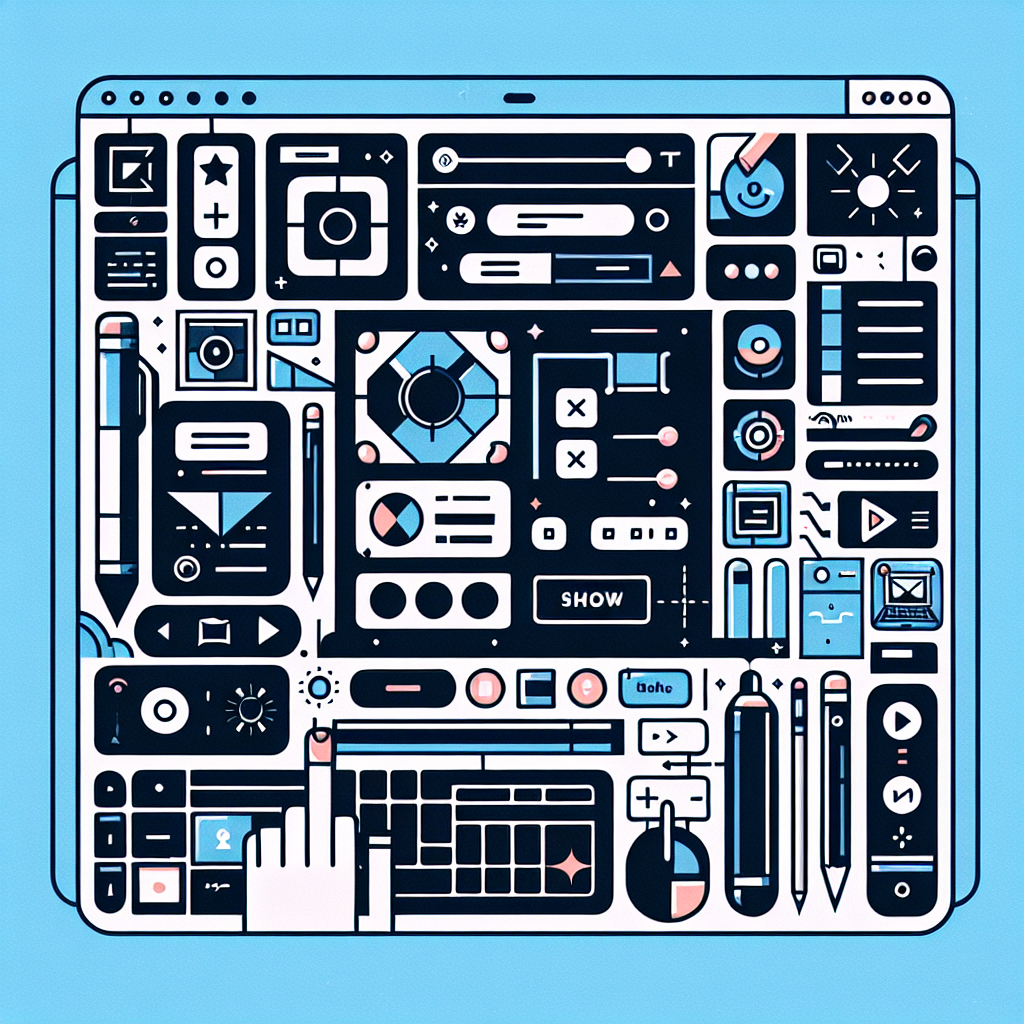
Key Elements of UI Design
Creating a killer user interface (UI) isn’t just about making things look pretty. It’s about making sure everything works smoothly and feels right for the user. Here are some key elements to keep in mind if you want to nail it.
Visual Elements
Visual elements are like the spices in a great dish—they make everything pop. We’re talking about typography, colors, images, icons, and all those little graphical bits. These elements need to work together to grab attention and guide users through your content.
Typography is a big deal. The right fonts and sizes can make your text easy to read and help users find what they need quickly. Colors aren’t just for show either; they set the mood and can even influence how users feel. Images and icons? They add flair and help explain things without words.
A well-designed UI can seriously boost your website’s conversion rate. Some studies say it can go up by 200% (Maze). If you’re looking for ideas, check out some user interface patterns and user interface examples.
Interactive Components
Interactive components are the bits users click, swipe, or type into. Think buttons, forms, menus, and sliders. These need to be user-friendly and make navigating your site a breeze.
Placement is key. Put buttons where users expect them to be. Size matters too—make sure everything is big enough to tap on a phone but not so big it looks clunky. Responsiveness is crucial; your site should work well on any device. And don’t forget feedback. Users need to know their clicks and taps are doing something, so use visual cues or animations to show actions.
User-Centered Design
User-centered design is all about putting the user first. Understand what they need, what they like, and what bugs them. Design your interface to make their experience as smooth and enjoyable as possible.
Market research is your friend here. Know your audience’s preferences, demographics, and pain points. Use wireframes and prototypes to test your ideas and get feedback. This way, you can tweak things before going live.
Collaboration is also a biggie. Get input from stakeholders, designers, developers, and users. The more perspectives you have, the better your final product will be. User feedback is gold—use it to make your design even better.
By focusing on these key elements—visual elements, interactive components, and user-centered design—you’ll create interfaces that are not just pretty but also functional and enjoyable. Stick to principles like clarity, consistency, and familiarity to make your UI even more user-friendly (Interaction Design Foundation). And don’t forget tools like Figma, Sketch, InVision, and Proto.io—they can make your design process a whole lot easier.
How UI Design Really Works
Creating a user interface (UI) that people love isn’t just about making things look pretty. It’s a step-by-step adventure that starts with understanding your audience and ends with a product that feels just right. Let’s break down the journey.
Getting to Know Your Audience
First things first, you gotta know who you’re designing for. This means diving into what your users like, what they need, and what they’re already using. Think of it as a detective mission where you gather clues about your audience’s habits and preferences.
By doing this, you can figure out what works and what doesn’t. You’ll spot trends and patterns that can guide your design choices. Plus, knowing your audience helps you stand out from the crowd and offer something fresh and exciting.
Sketching the Blueprint
Next up, it’s time to sketch out your ideas. This is where wireframes come in. Imagine wireframes as the skeleton of your design – they show where everything goes without getting bogged down in the details.
At this stage, it’s all about layout and structure. You decide where buttons, menus, and other elements will sit. Wireframes help everyone on the team get on the same page and make sure the design makes sense before adding the bells and whistles.
Testing the Waters
Now, you’ve got a basic layout. What’s next? Time to build a prototype – a working model of your design. This lets you see how everything flows and feels in real life.
You’ll test this prototype with real users to see how they interact with it. This is where you find out if your design is user-friendly or if it needs some tweaks. User feedback is gold here; it helps you fix any issues and make the design even better before it goes live.
Teamwork Makes the Dream Work
Designing a UI isn’t a solo gig. You’ll be working with developers, stakeholders, and other team members to bring your vision to life. Good communication is key – everyone needs to be on the same page to make sure the final product matches the original idea.
Regular check-ins and feedback sessions help keep things on track. By working together, you can combine different skills and perspectives to create a polished, user-friendly interface.
Wrapping It Up
UI design is a loop – you research, sketch, test, and collaborate, then do it all over again until you get it right. Each step builds on the last, leading to a final product that’s not just pretty but also practical and easy to use.
So, whether you’re designing a new app or revamping a website, remember: it’s all about understanding your users, planning carefully, testing thoroughly, and working well with your team. That’s how you create a UI that people will love.
Types of User Interfaces
User interface design isn’t a one-size-fits-all deal. Different folks have different strokes, and the same goes for how they interact with tech. Let’s break down the four most common types of user interfaces: Command Line Interface, Menu-Driven Interface, Graphical User Interface (GUI), and Touchscreen GUI.
Command Line Interface
A Command Line Interface (CLI) is like talking to your computer in Morse code. It’s all text-based, where you type commands to get stuff done. Think of it as the secret handshake of the tech world. Developers, system admins, and power users love it because it gives them a ton of control and flexibility. Sure, you need to remember a bunch of commands, but once you get the hang of it, it’s like having a superpower.
Menu-Driven Interface
A Menu-Driven Interface is like a choose-your-own-adventure book. You get a list of options, and you pick what you want using a keyboard or mouse. It’s perfect for folks who don’t want to memorize commands but still want to get things done efficiently. You’ll find these in apps, software, and websites where ease of use is key. It’s straightforward and user-friendly, making it a hit with a wide range of users.
Graphical User Interface
Graphical User Interface (GUI) is the rock star of user interfaces. It’s all about visuals—icons, buttons, menus, and windows. GUIs are super intuitive because you can see what you’re doing. No need to remember complex commands; just click on what you need. This makes GUIs perfect for desktop apps, mobile apps, and web interfaces. They’re designed to be easy to use and engaging, which is why they’re so popular.
Touchscreen GUI
Touchscreen GUI is the cool cousin of the regular GUI, designed for touch-enabled devices like smartphones and tablets. Instead of clicking, you tap, swipe, and pinch your way through the interface. It’s super intuitive and has changed the way we interact with our devices. Whether you’re scrolling through social media or playing a game, touchscreen GUIs make it all feel natural and fun.
Understanding these different types of user interfaces helps designers create experiences that are not just functional but also enjoyable. By picking the right type for the audience and the task at hand, designers can make interfaces that are easy to use and visually appealing.
Tools for Effective UI Design
Creating a slick, user-friendly interface isn’t just about making things look pretty—it’s about making them work seamlessly. Web developers have a toolbox full of goodies to help them do just that. Here are some of the top picks for UI design:
Figma
Figma is like the Swiss Army knife of UI design. It lets you build interactive prototypes, test them out, and keep everyone in the loop. With its cloud-based setup, you can collaborate in real-time, which is a game-changer for teams. Plus, it’s got a bunch of third-party plugins and a nifty pen tool for creating icons. No wonder it’s a hit among designers.
Sketch
If you’re on a Mac, Sketch is your go-to. It’s been around the block and is a staple in the design world. Whether you’re a newbie or a seasoned pro, Sketch has something for you. It’s packed with features like vector editing and prototyping, and it has a massive library of plugins. The best part? Its user-friendly interface makes it easy to create reusable design elements.
InVision
InVision is like the magic wand of prototyping. It lets you create fully functional prototypes with dynamic elements and animations. You can make clickable prototypes, use free design tools, and collaborate like a boss. It’s perfect for getting feedback from stakeholders and users, making it an essential tool in the UI design process.
Proto.io
Proto.io is a web-based tool that’s all about speed and ease. No coding required—just drag and drop your way to high-fidelity, interactive prototypes. It’s popular with designers, product managers, and marketers alike. With its extensive library of components, you can showcase your designs with realistic interactions and animations, giving everyone a sneak peek of the final product.
These tools are the secret sauce for creating stunning, user-centric interfaces. Each one brings something unique to the table, catering to different workflows and preferences. By using these tools, designers can turn their UI dreams into reality and deliver experiences that users will love.
Principles of Effective UI Design
Creating a user interface that clicks with people isn’t rocket science, but it does require some key principles. These principles make sure your interface is clear, consistent, and feels like home to users.
Clarity and Usability
First off, clarity is king. A clear UI uses familiar features that are easy to interact with. Think of it like a well-organized kitchen—everything you need is right where you’d expect it. Put the main navigation menu at the top, make clickable elements pop, and voilà, you’ve got a user-friendly interface. When users can easily figure out what each element does, they’re more likely to stick around and get stuff done (Flux Academy).
Consistency and Trust
Next up, consistency. This is your secret weapon for building trust. When your design elements like colors, fonts, and button placements are consistent, users feel like they’re in familiar territory. It’s like walking into your favorite coffee shop—everything’s where it should be, and you know exactly what to expect. Inconsistent design, on the other hand, feels like a messy room—confusing and off-putting (Flux Academy).
Familiarity and User Control
Familiarity is another biggie. Users love interfaces that feel like old friends. Stick to tried-and-true design patterns and conventions, and you’ll make users feel right at home. This reduces the learning curve and makes navigation a breeze.
Then there’s user control. Let users feel like they’re in the driver’s seat. Give clear feedback for their actions, allow them to undo or redo steps, and offer customization options. When users feel in control, they’re more confident and satisfied with their experience (Maze).
By weaving in clarity, consistency, familiarity, and user control, you can craft interfaces that are not just functional but also a joy to use. These principles, along with accessibility and usability, ensure your UI hits the mark for your audience.