Reading time: 3 minutes.
In the digital marketing landscape, newsletter opt-in forms play a pivotal role in building a business’s email list, enhancing customer engagement, and boosting overall marketing efforts. A well-crafted opt-in form not only respects the user’s experience but also maximizes the number of quality leads. This article delves into the best practices for designing newsletter opt-in forms, covering aspects like layout, fields, response, and follow-up strategies.

1. Understanding the Importance of Newsletter Opt-In Forms
Before diving into best practices, it’s crucial to understand why newsletter opt-in forms are vital. They serve as the first point of contact between your brand and potential subscribers, setting the tone for future communications. An effective form can significantly increase your subscriber list, offering a direct line to your audience for promoting content, products, and services.
2. Layout: The Foundation of an Effective Opt-In Form
A. Simplicity and Clarity
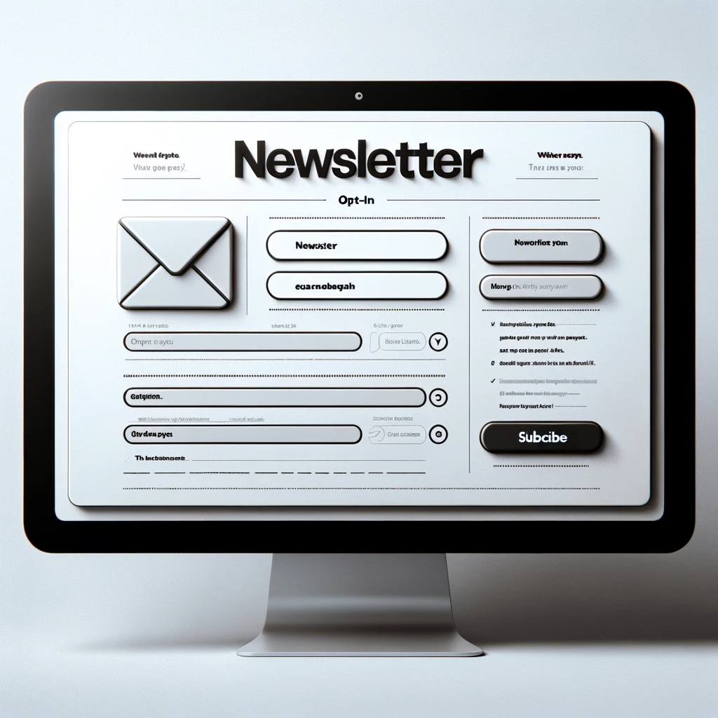
A cluttered or confusing layout can deter potential subscribers. Opt for a clean, straightforward design that makes it immediately clear what the form is for. Use ample white space to make the form elements stand out and ensure the form is easily readable on all devices.
B. Eye-Catching yet Non-Intrusive Design
While the form should be noticeable, it shouldn’t interrupt the user’s browsing experience. Strike a balance between visibility and subtlety. Use contrasting colors to draw attention but avoid overly aggressive pop-ups that might annoy visitors.
C. Strategic Placement
Place the form where users can easily find it without searching. Common effective locations include the top of the sidebar, the footer of the website, and as a floating banner. Additionally, consider using exit-intent pop-ups, which appear when a user is about to leave the site.
3. Fields: Asking for the Right Information

A. Minimal Fields
Request only essential information. Typically, an email address should suffice. Asking for too much information can overwhelm or deter potential subscribers. However, if more data is necessary, like a name for personalized emails, keep it limited.
B. Clear and Concise Labels
Ensure that each field is clearly labeled. Users should understand what information is required and why. For instance, labeling a field with “Email Address” is straightforward and tells users exactly what to input.
C. Privacy Assurance
Include a brief note on privacy to reassure users that their information will be handled securely and won’t be shared with third parties.
4. Response: The Art of Acknowledgment
A. Immediate Confirmation
Once a user subscribes, an immediate on-screen confirmation should appear. This acknowledgment reassures the user that the subscription process was successful.
B. Welcome Email
Automate a welcome email that gets sent immediately after subscription. This email should thank the user for subscribing, possibly include a welcome offer, and set expectations about the type of content they will receive.
C. Clear Unsubscribe Option
Provide a clear way to unsubscribe in your emails. This enhances trust and complies with laws like the CAN-SPAM Act.
5. Follow-Up: Maintaining Engagement
A. Regular and Relevant Content
Send newsletters consistently, but don’t bombard your subscribers. The content should be relevant to their interests and aligned with your brand’s messaging.
B. Personalization
Use the information provided at the opt-in stage for personalization. Even simple touches like addressing the subscriber by their first name can increase engagement.
C. Feedback and Surveys
Occasionally ask for feedback through surveys. This not only provides valuable insights for improving your content but also makes subscribers feel valued and heard.
6. Testing and Optimization
A. A/B Testing
Regularly test different elements of your opt-in form, like layout, wording, and color schemes. A/B testing can reveal what resonates best with your audience.
B. Analytics and Adjustment
Use analytics to track the performance of your form. Look at metrics like conversion rate and bounce rate to understand user behavior and make necessary adjustments.
7. Legal Compliance and Ethical Considerations

A. GDPR and Other Regulations
Ensure your opt-in form complies with regulations like GDPR. This includes clear consent mechanisms, data protection statements, and respecting user privacy.
B. Ethical Practices
Avoid deceptive practices like pre-checked boxes or hidden terms. Transparency is key to building long-term relationships with your subscribers.
8. Conclusion
Crafting an effective newsletter opt-in form is a blend of art and science. It requires understanding your audience, respecting their experience, and continuously testing and optimizing your approach. By adhering to best practices in layout, fields, response, and follow-up strategies, you can create a form that not only looks great but also performs exceptionally, driving your email marketing success.
Remember, the goal is to build a list not just of any subscribers, but of engaged individuals who find value in what you offer. With patience, creativity, and adherence to these best practices, your newsletter opt-in form can become a powerful tool in your marketing arsenal.


