Reading time: 7 minutes.
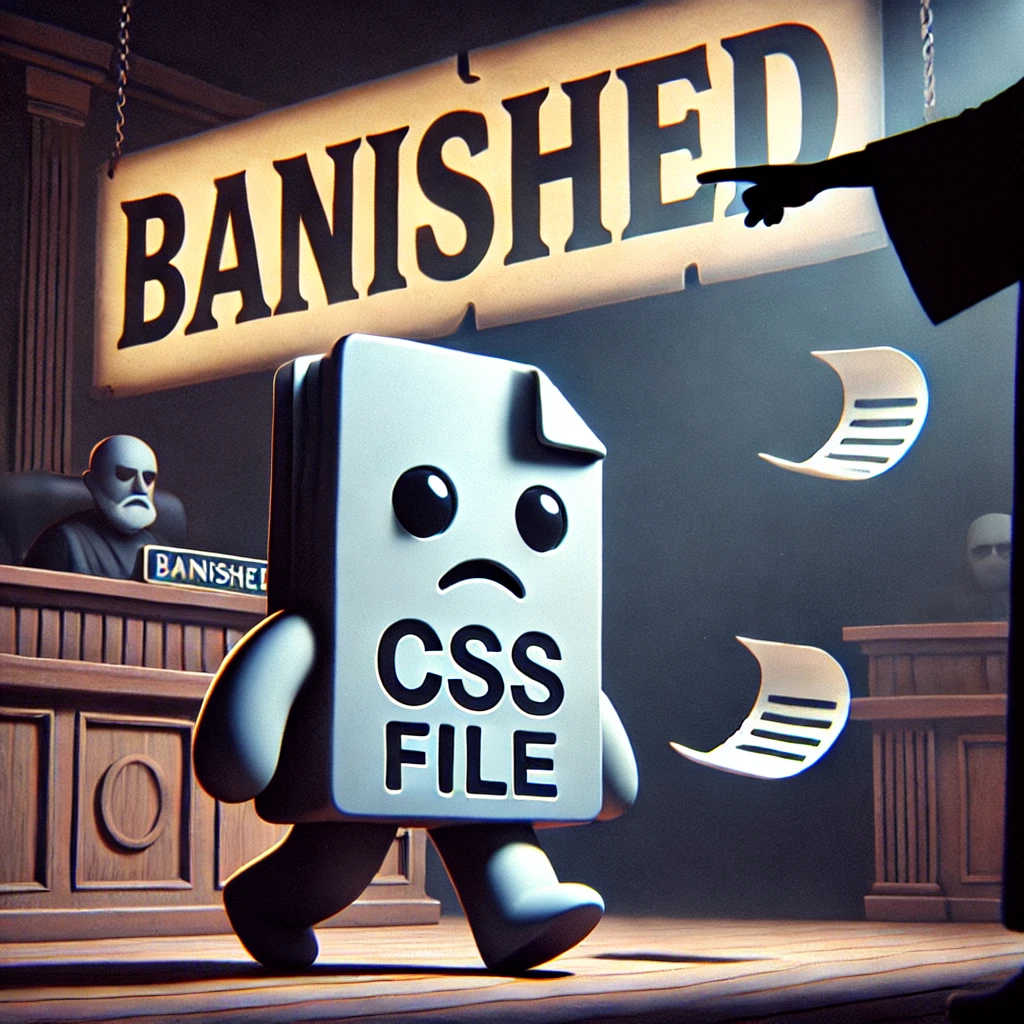
If you’ve been working with CSS for a while, you’ve probably heard the word “deprecated” thrown around when discussing certain properties or methods. I remember when I first came across it — the idea that something I had been using and relying on was now considered outdated or obsolete was a bit of a shock. It’s like finding out your favorite pair of jeans is no longer in style! But when it comes to web development, keeping up with the latest standards and practices is essential to ensure your websites are modern, efficient, and functional. So, today, let’s talk about some of the most common deprecated CSS properties and why you should avoid them in your projects.
What Does “Deprecated” Mean?
Before we dive into the specifics, let’s take a moment to clarify what “deprecated” actually means. In the context of CSS (or any programming language, really), when a feature is deprecated, it means that it’s no longer recommended for use and might eventually be removed in future versions. The feature may still work for now, but it’s on the chopping block. Essentially, using deprecated features is like building a house with materials you know won’t last — eventually, things will start to crumble.
Now, I don’t know about you, but when I’m working on a website, the last thing I want is for something to suddenly stop working because it was based on outdated standards. That’s why keeping track of deprecated properties is crucial to building long-lasting and future-proof websites.
The Box Model Shift: box-sizing
One of the most common issues developers encountered early on was the infamous box model. By default, the width and height properties in CSS only account for the content, and not the padding, border, or margin. As a result, developers had to constantly tweak their layouts to get elements to behave as expected. You might remember the days of frustrating layout bugs caused by the “standard” box model. Those were rough times.
Thankfully, CSS introduced the box-sizing property, which revolutionized how we define the dimensions of an element. With box-sizing: border-box;, the width and height of an element include padding and border, making layout calculations much simpler and more intuitive.
However, the old model is still around in the form of box-sizing: content-box, and while it’s not technically deprecated, it’s definitely considered outdated. In modern web design, sticking to border-box is the best practice, as it gives you more control over element sizing without the headache of recalculating dimensions for every little tweak.
The Fall of float for Layouts
If you’ve been coding for a while, you probably have a bit of a love-hate relationship with the float property. Back in the day, we used float for everything from simple image alignment to complex grid layouts. But let’s be real — it was never meant to be used for layout purposes. float was originally designed to wrap text around images, and using it for layout often resulted in odd behaviors, like collapsing parent containers or unpredictable element positioning.
Then came CSS Grid and Flexbox, and the web development community breathed a collective sigh of relief. These new layout modules offer far more flexibility and precision than float ever could, without the quirks and inconsistencies.
While float is still supported by browsers, using it for layout is a deprecated practice. Flexbox and Grid are now the go-to methods for creating responsive, flexible, and easy-to-maintain layouts. If you’re still relying on float for structuring your website, it’s time to let it go and embrace these more modern tools.
Example: Moving from Float to Flexbox
If you’ve been floating divs left and right to create columns, switching to Flexbox is an easy and worthwhile upgrade. Here’s a quick example:
/* Old school float-based layout */
.container {
  width: 100%;
  overflow: hidden;
}

.column {
  width: 30%;
  float: left;
  margin-right: 5%;
}

.column:last-child {
  margin-right: 0;
}
With Flexbox, the same layout becomes much simpler:
/* Flexbox layout */
.container {
  display: flex;
  justify-content: space-between;
}

.column {
  width: 30%;
}
Not only is the Flexbox version cleaner, but it’s also more flexible and easier to adapt for different screen sizes.
Goodbye, clear
Speaking of float, let’s talk about its old companion, the clear property. The purpose of clear was to stop floated elements from overlapping with other elements, which was often necessary when using float for layouts.
For example, if you had an element that followed a floated item and you didn’t want it to wrap around the float, you would use clear: both;. It was a bit clunky and felt more like a workaround than an elegant solution. But as with float, modern layout methods like Flexbox and Grid make the need for clear obsolete. These new tools handle layout control in a much more intuitive way, so you can safely say goodbye to the clear property in most cases.
The Demise of z-index:auto
You might remember the days when stacking elements with z-index was a bit of a headache. While z-index is still a powerful and necessary tool for controlling the visual stacking order of elements, using z-index: auto; is no longer a recommended approach. By default, browsers will assign stacking contexts to elements, and this can be managed more effectively using specific values like 0, 1, or -1, rather than relying on auto.
With better support for more modern CSS features like position: sticky;, which offers a more elegant solution for creating sticky elements that maintain their stacking order, the reliance on z-index: auto has significantly decreased. Stick with numeric values for a more consistent and predictable stacking context.
Bye-Bye outline:none;
For a long time, developers used outline: none; to remove the default focus outline on buttons and links, especially for aesthetic reasons. I know I was guilty of this back in the day, thinking I was making my website look sleeker by removing that “ugly” focus ring. But, as we’ve come to realize, this practice isn’t great for accessibility.
The focus outline is an important visual cue for users who navigate websites with a keyboard, and removing it without providing an accessible alternative can make your site difficult to use for those with disabilities. The modern approach is to style the focus outline rather than removing it altogether, ensuring your site remains user-friendly while still looking polished.
Here’s a quick example of how you can style the focus outline:
button:focus {
  outline: 2px solid #00aaff;
  outline-offset: 2px;
}
This way, you still provide a visible indication of focus, but in a way that fits your design.
The Death of Vendor Prefixes
Remember the days when we had to use vendor prefixes for everything? -webkit-, -moz-, -o-, and -ms- were once staples of cross-browser compatibility, especially for newer CSS features that hadn’t yet been standardized. We spent so much time adding these prefixes to our stylesheets that it almost became second nature.
But as CSS has matured and browsers have become more standardized, the need for vendor prefixes has diminished significantly. Most modern browsers now support new features without the need for prefixes, and tools like Autoprefixer (a PostCSS plugin) can automatically add them for you when necessary.
While vendor prefixes aren’t deprecated per se, manually adding them to your CSS is considered outdated practice. Let tools like Autoprefixer handle that for you so you can focus on writing clean, maintainable code.
marquee and blink: The End of an Era
I couldn’t write an article on deprecated CSS without mentioning marquee and blink. These tags have been the stuff of legend in the web development world — not for their functionality, but for their infamy.
The <marquee> tag was used to create scrolling text across the screen, while <blink> made text flash on and off. These features were popular in the early days of the web when flashy (pun intended) animations and effects were all the rage.
Thankfully, both of these tags are now deprecated. Their functionality was more gimmicky than useful, and they were quickly abandoned in favor of more sophisticated animation techniques like CSS animations and transitions.
If you ever find yourself tempted to bring back the scrolling text or blinking effects, consider using modern CSS techniques instead. For example, you can create smooth, controlled animations with @keyframes:
@keyframes marquee {
  0% { transform: translateX(100%); }
  100% { transform: translateX(-100%); }
}

.marquee-text {
  display: inline-block;
  animation: marquee 10s linear infinite;
}
This gives you far more control over the animation and ensures it works consistently across all browsers.
Conclusion: Embrace the Future
It can be tough to let go of old habits, especially when it comes to coding. We tend to stick to what we know, even if it’s no longer the best approach. But staying up to date with modern CSS practices is crucial for creating websites that are not only beautiful and functional but also future-proof.
By moving away from deprecated features like float, clear, and vendor prefixes, and embracing newer layout techniques like Flexbox and Grid, you’ll find that your code becomes cleaner, more efficient, and easier to maintain. And with tools like Autoprefixer and modern focus styling, you can ensure your site is accessible and works well across all devices and browsers.
So, next time you sit down to write some CSS, remember to check if the properties you’re using are still relevant. It’s always better to build with the future in mind! Happy coding!